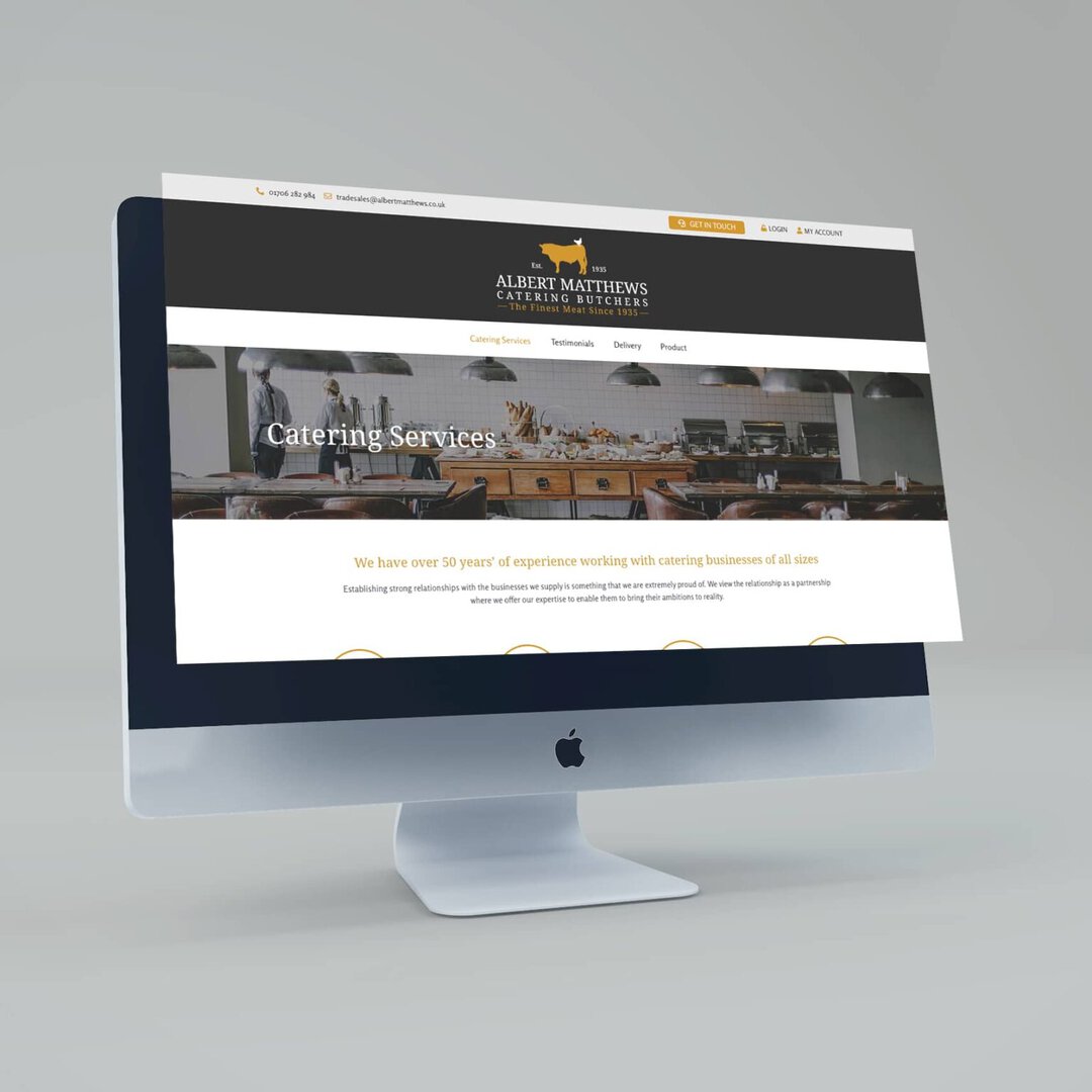
Albert Matthews Butchers is an award-winning online butcher that sell premium free-range meat and poultry delivered to their customer’s door. Founded in 1935, with almost 90 years in business they take pride in delivering the finest cuts to both business clients and personal customers.

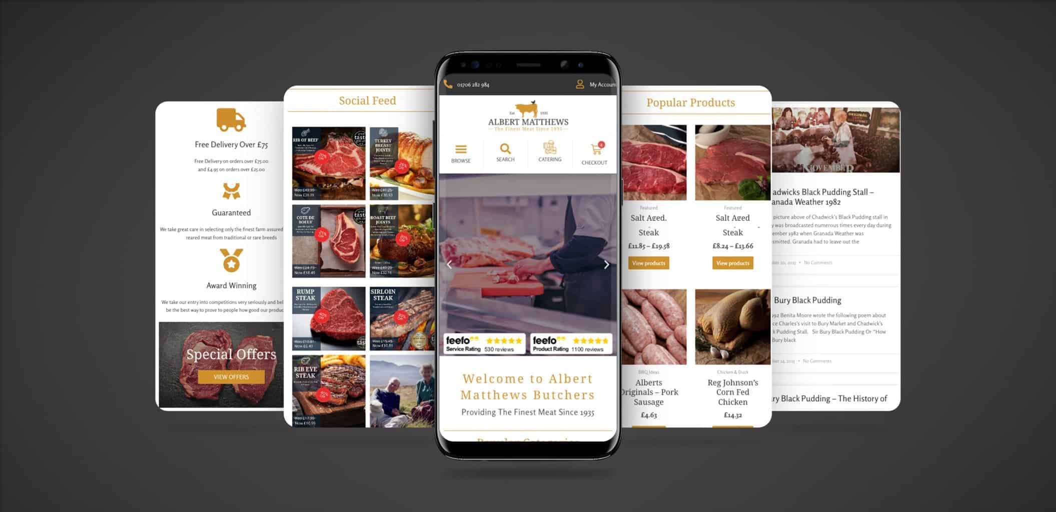
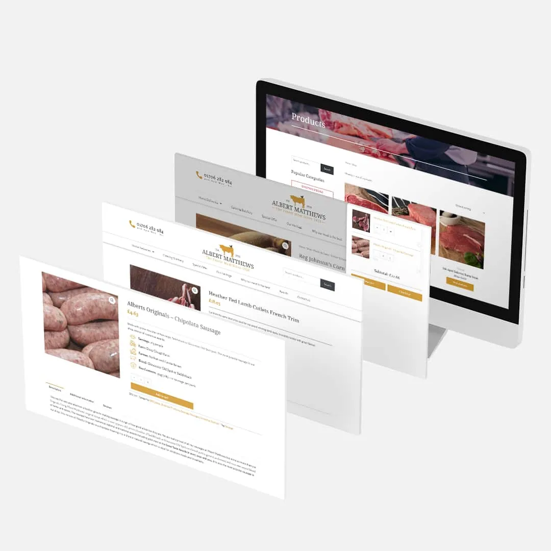
When we were approached by Albert Matthews, the aim was to completely redesign and build a new e-commerce website to provide a platform that reflected their 90 years of heritage. The website needed some significant structural organisation to take their product catalogue and design e-commerce interfaces with intuitive user journeys.
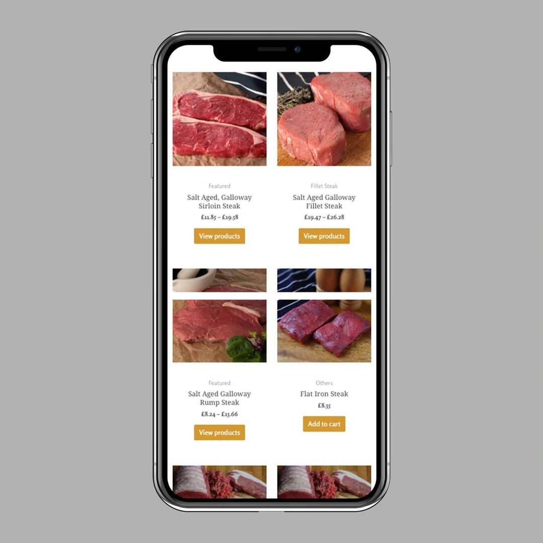
Identifying user journeys are the starting line for our web design projects, understanding the desired outcomes of the client allows us to engineer a route for the customer to achieve those results. We took the extensive product catalogue and organised it into logical product categories ensuring that the most popular products were front and centre while still giving less popular products space to be seen and grow.


Albert Matthews Butchers has a rich history, and it was important to modernise the website without compromising on its history and traditions.
Building on the existing brand we designed a new logo and selected an eye catching colour pallet all of which helps to portray the high quality products they produce. To compliment the new brand, we incorporated a selection of high-resolution photos to showcase the products on offer.
The visuals were designed to be distraction free with minimal text helping to draw customers into the user journey and fine the products they are looking for with ease.
A carefully constructed website allows customers to either search for the products they’re looking for or browse through a range of meats in different categories. We made sure to make each product accessible in as few clicks as possible, reducing sales friction and getting customers to the checkout.
One of the core features required was to provide an interface to sell their famous meat boxes. The user can select from a predefined range of meat options, building a customised bundle of delicious products.
Customers can also select a meat box with a fixed selection, but they are able to customise the quantities of each, giving more flexibility in the cost of their meat boxes.