Why do we need a high quality e-commerce product page?
We are directly and indirectly spending large amounts of time, money and resources getting web site visitors deep enough in to a website that they are on our e-commerce product page. Knowing your customer is only a click or two away from becoming a customer – buying, in to your brand and your products – already has a sense of achievement.
Thoughts of cross-selling and up-selling begin to seep in to your mind. What’s the best way to retarget them in the future? How much are they likely to spend? What colour variations of this product sell best? When will they… wait… oh wait – they’ve gone. Another abandoned cart. And you have no idea why.
There is however a good chance that this is because you have not fully enabled and optimised your product pages. Let’s begin our journey to improve your pages and increase your sales.
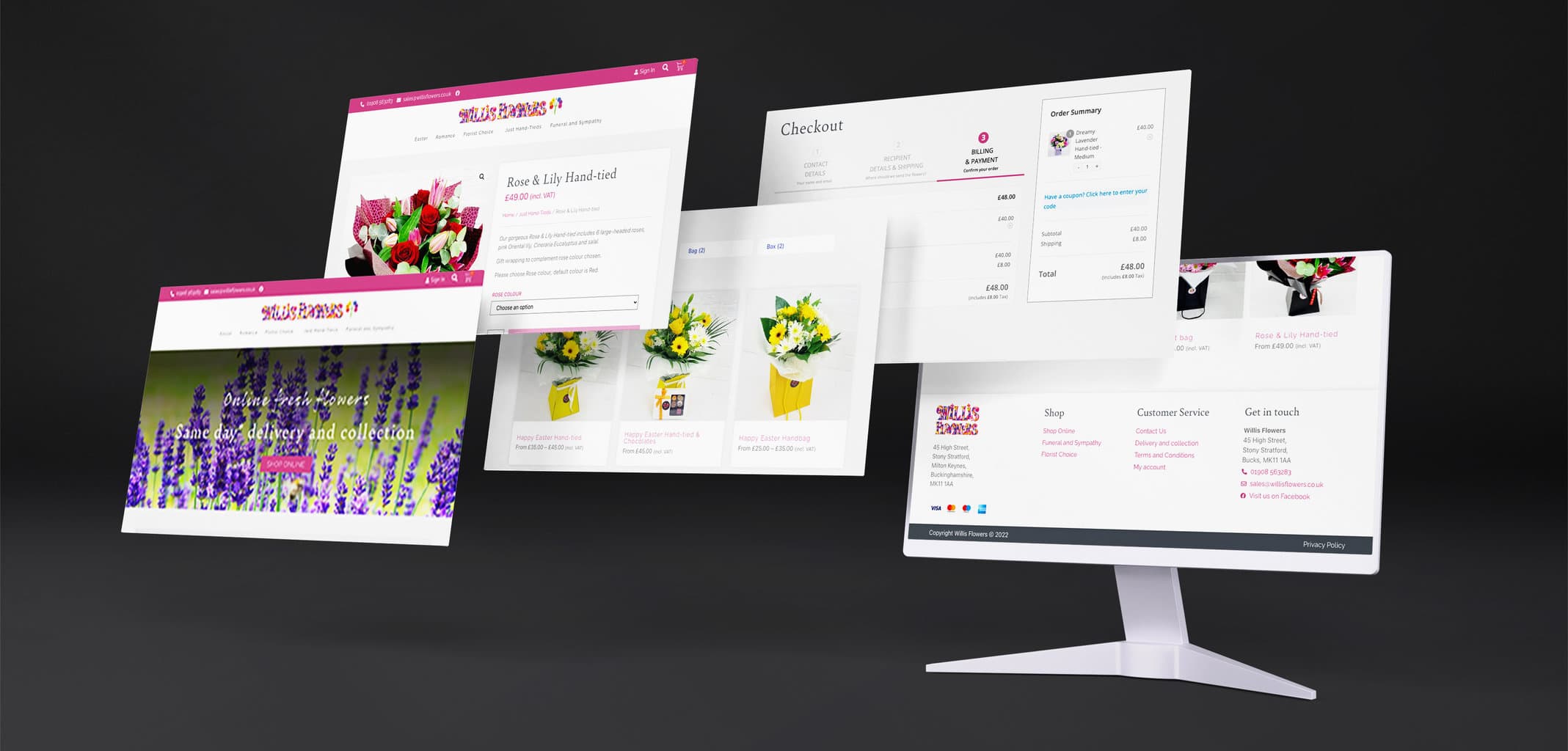
What does an e-commerce product page look like?
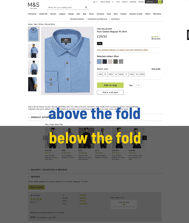
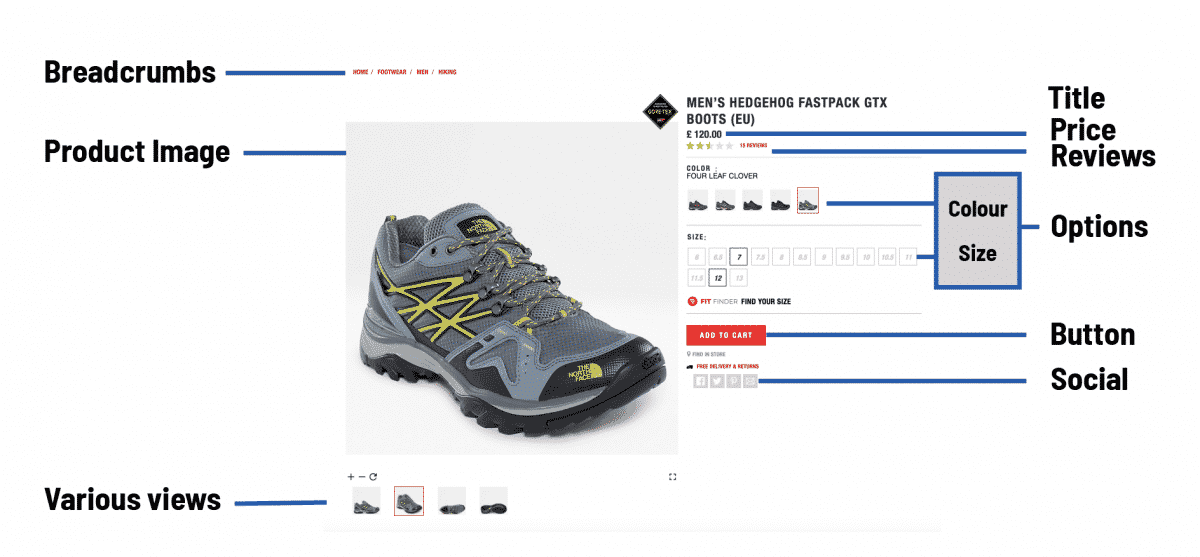
Let’s begin by taking a look at a few examples so that we can understand the standard structure of the majority of e-commerce product pages and the components that make them up.
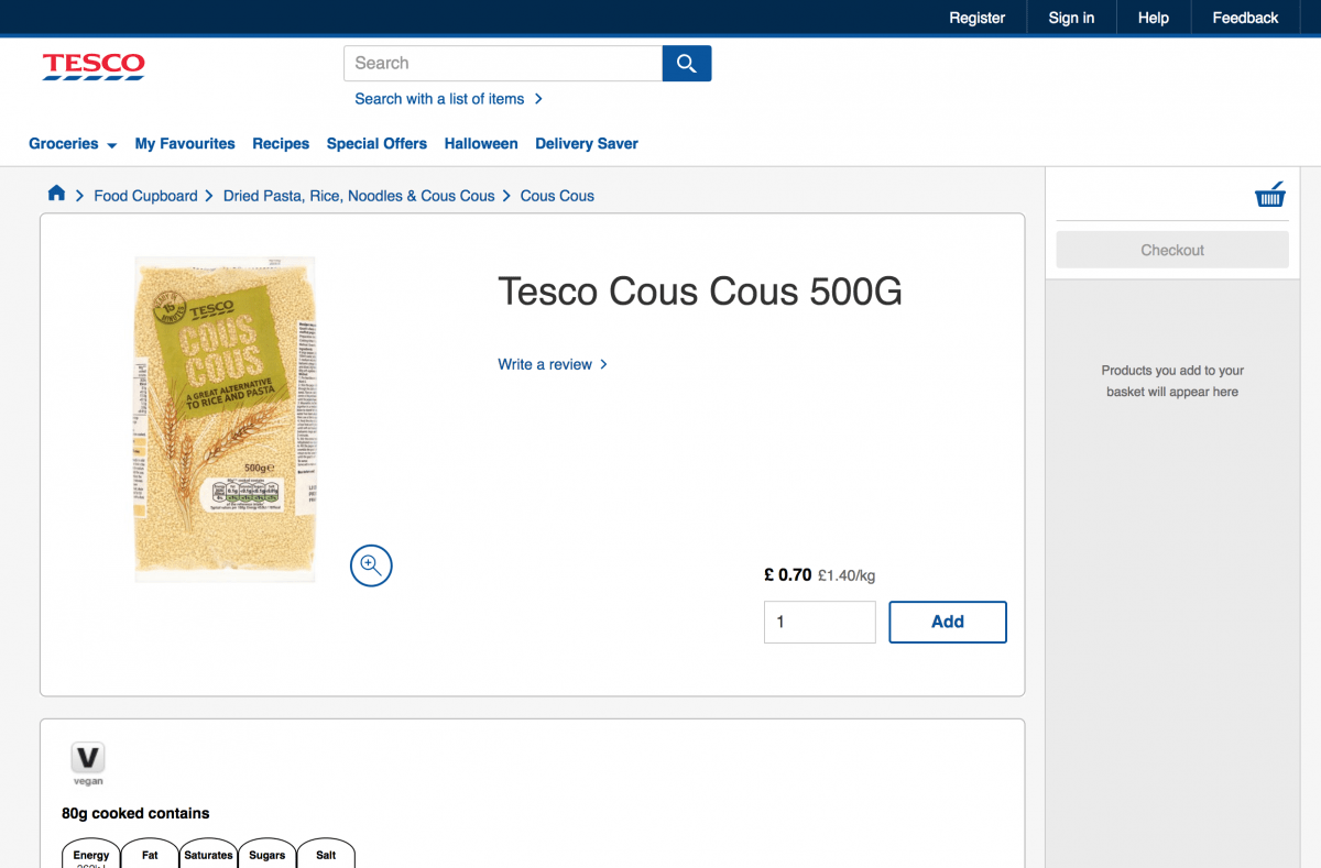
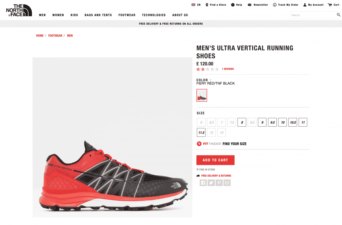
What does a standard e-commerce product page look like?
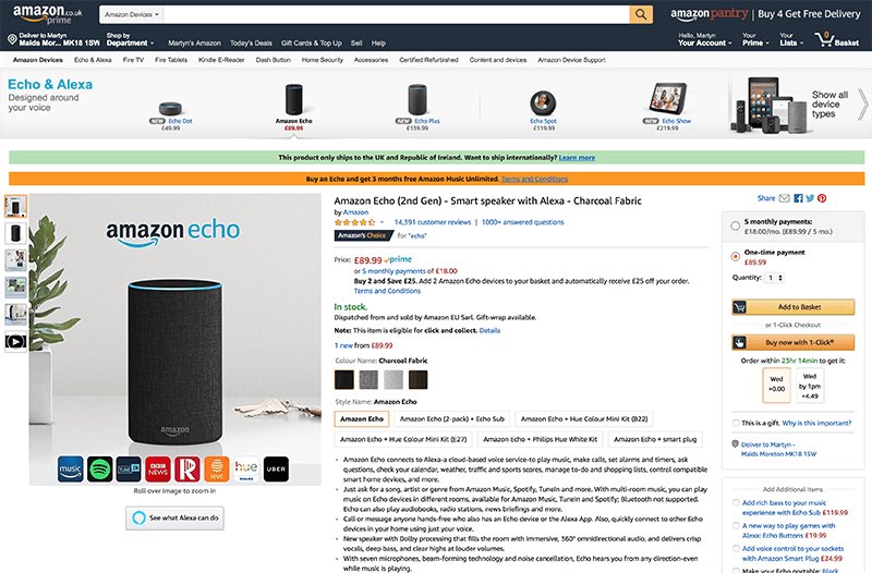
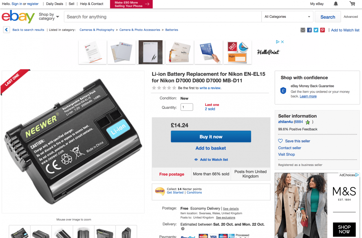
As you can see many of the pages follow an almost identical structure with the large image sitting on the left, and the title and product descriptions on the right. All of the key information is presented above-the-fold (the content on the screen that you can initially see when the page loads up), while longer more descriptive texts and additional visual content is located further down the page, or below-the-fold (content not visible when the page initially loads).
How can I structure an e-commerce product page?
On almost every online store’s product page, you are going to see the following essential components: title, product images, product descriptions, pricing, buttons, categories, and tags. These pieces of information help your customers to make the decision as to whether they will buy and are essential to include in any e-commerce product page .
We have also included commonly found features, including related or similar products, reviews, social sharing and stock checking as optional extras that you will likely want to incorporate in to most e-commerce websites.
1. TITLES
It sounds simple doesn’t it? The simple and humble title. It does amaze me what people sometimes put as product titles. Above all it should be kept concise and accurate.
- Spelling – Is it mispelt? There are few things more annoying than not being able to find something because it is spelt incorrectly. Don’t even think about merely double checking – triple, quadruple, quintuple check your product titles, and then check them again.
- Model numbers – Did you miss the model number off? Yes? Well you’ve certainly just missed out on your site visitors finding it through your search bar. Don’t even worry about Google searches – they’re never going to make it over to your store.
- Overcramming – Don’t do it! Keep it simple, informative and factual.
- Misleading – never try and trick people on to a product page by deception. You need to establish trust with customers and this is a sure-fire way of never seeing a drop of their online spend.
- Additional uses – commonly used on eBay and Amazon, adding short pieces of important and informative info, such as ‘compatible with’ will help build trust and demonstrate expertise to your potential customers.
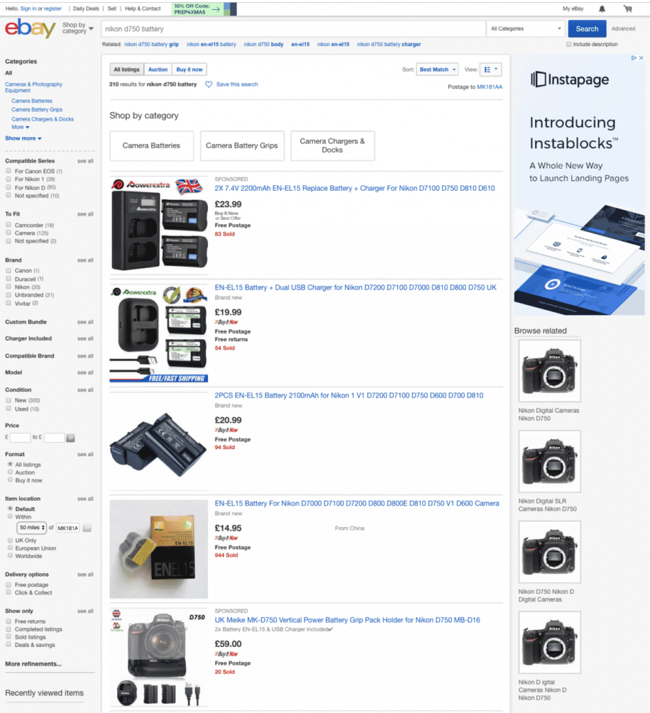
Let’s have a quick think about this, as it may seem simple at first. Let’s say that I have a Nikon D750 camera, and I need a new battery for it. What am I going to search for? ‘Nikon D750 camera battery’. This is what we will call our search term.
If we have a look at how this search returns the results in eBay, we can begin to learn how the title becomes vitally important.
First up, you will notice that all the relevant keywords in the search term are contained within these titles. The closer a match is to the exact search phrase, the higher the result will appear within internal search terms.
The second thing that becomes apparent is that they have already provided me with the type of battery I require – an ‘EN-EL15 Battery’. They’ve educated me, and established trust, by providing that information.
The third piece of data that I can see is that this battery is also compatible with several other Nikon cameras. This is very useful information to pass on if people are uncertain about exactly what battery they require. This seller has now demonstrated their expertise.
In summary, you need to make sure that your product title is clear, accurate and relevant. Allow it to get found by including model numbers and alternative products that it is compatible with and you will find more people visiting and more visitors buying.
2. PRODUCT IMAGES
Your images need to be great. If you can add video to it as well, then even better. Here’s our check list to help you know what product images you need to include in any e-commerce product page
- Unique – get your own bespoke product photography if possible, or use relevant imagery provided by the supplier.
- Good quality – don’t take photos with your phone. If you have a digital camera, get a simple lighting setup that will allow you to take decent resolution images.
- Different viewpoints – If the product requires it, why not include multiple angles of the product? Display them either as separate images or as a collage.
- Details – take high quality photos of the detailed or interesting parts of the product to emphasise them.
- Variations – different sizes, colours, styles, patterns are all important to show. You don’t want to lose a customer because you didn’t show them it was available in denim.
- Context – show how the image will be used, or what it will look like in proportion to the way it looks. What exactly will fit in a bag product?
- Creative – If your product allows it, be creative. Show that you have some flair and style that other company’s don’t and stand out.
- Video – The most impressive medium for communicating, explaining and exhibiting features by far.
If you budget allows it, hire a professional photographer to get all of your product shots. They are time consuming, but an experienced product photographer will be able to assist in the planning, shooting and editing.
Make a good shot list that includes all the options you require and make sure to work through it systematically so that you don’t miss anything important!
3. PRODUCT DESCRIPTIONS
Writing strong, informative product descriptions for each e-commerce product page is imperative to its successful sales figures. You’ve done the hard work getting them on to your product page, and now they want details, sizes, descriptions.
Do’s
- Short and long descriptions – Most e-commerce plugins allow a short and a long description. They help site visitors to skim read while they are browsing and before providing useful and relevant content when they catch something of interest.
- Simple and informative – nobody likes having to go to a thesaurus because you’ve used a word that was popular in Welsh mythology 1200 years ago. Use clean and simple sentences to form your product descriptions and avoid sales talk.
- Format – Use clear, easy to display formatting on each e-commerce product page. If you have a list of features, list them using simple bullet points. Use enough line-height so it’s not crammed up and don’t get too carried away with hover over text for each colour option.
Dont’s
- Waffle – Avoid waffling on and using long sentences. In short – nobody cares how many adjectives you can cram in to a sentence. If it doesn’t add something of use, it’s detracting from what you are writing.
- Don’t use cliches – They make people cringe, they are massively overused to increase word counts and are often very dated. Be creative and use something original.
Nothing long winded, nor elaborate is required – just the facts on the item in question. Get everything well laid out and informative and you’ll be on to a winner. Make each e-commerce product page stand out and reap the benefits!
4. PRICING
Have you ever committed to buy something before you even knew the price? Of course you haven’t, and don’t expect anybody else to either. In short, full transparency, showing a clear list of variables and the price implications with a clearly visible price in the correct currency will get you well on track.
- Visibility – If your potential customer has been browsing your product categories already they’ll potentially have already seen the price. If they’ve just landed here straight out of Google, they won’t have seen it yet. Make sure it’s clearly visible.
- Currency – Yes, the first ‘w’ in www stands for ‘world’. Don’t assume that people will be visiting from your locality. Make sure that the relevant currency symbol is showing for the region that the person is visiting from. If this isn’t an option then US dollars is a safe go to.
- Delivery cost – if you are calculating delivery options, it’s highly likely that you will need your customers to enter a postcode or be logged in already. If you have a flat delivery fee for a particular e-commerce product or item then you need to choose if you want this displayed on the e-commerce product page.
- Options – Just because your white shoes are £50, it doesn’t mean the ones with red trim are going to be the same price. Make sure that the price of options is clearly listed and the overall price changes when selections have been made.
Make sure that your pricing is there because without it you’ll be at a loss.
By default it should update automatically as you add extras, or change the options of the variable products.
Let it be seen, styled accordingly and displayed elegantly to enhance the look and feel of your e-commerce product page.
5. BUTTONS
You’re not selling drugs to teenagers, so there’s no need to do it in an underpass out of site from everyone. This is your next CTA – the next step in your customer’s journey. Don’t hide it away under any circumstances.
- Buy Now – Consider using ‘Buy now’ when you are selling a very small range of products. This works well for software and large physical items such as garden sheds, where you are unlikely to be purchasing more than a single unit.
- Add to basket – If you expect your site visitors to make more purchases, then ‘Add to basket’ may be better fitting. Ideal for supermarkets and department stores where multiple items are usually purchased in one transaction.
- Styling – make sure there is sufficient contrast between the background and the button colour. Also make sure that the contrast between the button colour and the button text colour is enough. Try strengthening the weight of the font if it is slightly illegible.
We’ve all seen them. Often dressed in red against a white background to maximise their contrast ‘Buy Now’, ‘Add to Cart’ and ‘Checkout’ buttons are the most attention seeking buttons out there. Don’t disappoint!
6. CATEGORIES & TAGS
Not only are these helpful when organising products and assigning parent categories to items, but they can also be used to create entire pages with categorised products. Tags can be used to filter content.
CATEGORIES
- Structure – categories are primarily used to keep things in order. Make sure that each product sits in its own category.
- Product category pages – CMS’s such as WordPress allow creation of pages by simply selecting a specific category from the e-commerce menu.
TAGS
- Multiples – use multiple tags to allow the product to appear in all the relevant areas that it needs to.
- Filtering – the key benefit for tags is that it allows the ability to filter your e-commerce products live on a page. This can be done through sliders / radio buttons and checkboxes.
Creating hierarchical categories and well labelled tags will help potential buyers find the content quickly and easily. By adding them on to each product page, you allow customers to see a range of options they may not have considered previously.
7. RELATED / SIMILAR PRODUCTS
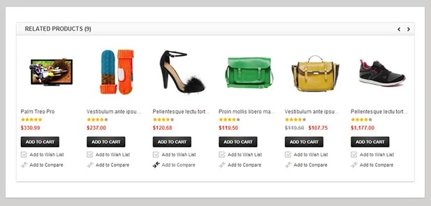
Sometimes a visitor may just be browsing when something catches their eye and they click on it just out of pure interest. The chances are that it’s not something they are going to buy right there and then. If you are clever about it, you can begin to display other similar items to try and entice them in to a sale.
- Price range – other items that are within a similar price range are likely to resonate better with people who are browsing. If you click on a £3.55 pair of earrings from Argos, it’s unlikely you will be interested in buying £99 Swarovski earrings.
- Visual – similar means exactly that. Search through your tags to see products that are visually the same.
- Purpose – Carefully consider the practicality of the products and ask yourself if they do the same job or have the same function.
For returning customers, you may consider this as an opportunity to try and up-sell. It’s a great time to demonstrate your knowledge of your product range and expertise in the field. Use the opportunity to gently guide customers through your site and you never know, with some assistance they may end up with several items in their basket.
8. REVIEWS
Now this is a difficult one. Should I include reviews or not? Good feedback is fantastic, and it stops you having to blow your own trumpet about how great your products are. Hearing it from a third person is like gold dust.
On the other hand, if you have plenty of bad reviews, there are several things that you can do to fix it. Generally speaking negative feedback is usually only submitted if the commenter doesn’t want to see improvements – but beware the trolls.
- Reply – show that you care about the feedback. Take it at face value and show that you will do what is necessary to improve your service or product in the future.
- Remove – If the issue is related to a single product then you may want to consider removing the product from your product offerings entirely.
- Turn off comments – A last resort if you are getting more negative feedback than you can handle. This is probably a sign that you need to re-evaluate underlying issues.
Your e-commerce product page needs to build trust with your potential customers. Trust can be built through reading reviews. Reply to reviews, both good and bad, and learn from them.
Bad reviews are invaluable feedback as to how you can do things better. Whether this be through product development, or changes in the packaging and delivery methods, having the problem highlighted will provide the information you need to adapt.
9. SOCIAL SHARING
Who doesn’t want people sharing their products across their customers’ social media accounts? Make it as easy as possible to do.
In 2018 who is going to click on the link in the address bar, select copy, then go to their Facebook page and paste the link to share it unless the content they are going to share is completely out of this world. That’s right – people are lazy and becoming increasingly more so.
Make it easy to share you e-commerce product page with a simple plugin that allows one-click sharing to their social media channels.
Simple sharing buttons mean within two clicks your product will be shared to all of their contacts. The only time that I may hesitate with this would be if a particular product has received masses of negative feedback.
This methodology can even be used by your own company to notify your clients that you have a new product in.
10. STOCK LEVEL
Knowing if something exists before you buy it can be useful. If it is an item that is being bought as a birthday gift, then it will need to arrive by a certain date. Imagine how your kids would feel if they had no present to open on their birthday…
- Honesty – be honest with your site visitors and potential customers. Don’t tell them it will be there if you can’t guarantee it. It will only result in negative feedback.
- Backorders – If you are expecting to receive stock then by all means take orders for when you do receive it. As long as the customer is aware of the timeframe, then I see no problems.
- Limiting – with e-commerce platforms such as WooCommerce, clever plugins allow a seller to limit the amount a buyer can purchase based on the number of items in stock. If I had 1,000 items, I could limit it so that one buyer could only buy 10. But if I had 100 items, I may want to limit it to 2 items per order. This will give more customers a chance to obtain the items.
Stock management is a separate topic entirely to what this article is about, however knowing that there are options for showing your stock level may help you make the choice as to whether it is visible or not.
Make sure you are using an API that integrates with your sales channels to keep your stock levels accurate!
E-Commerce Product Page Check List
- Take your time to make sure that all of your written content is accurate, including your product title.
- Don’t scrimp on paying a product photographer to take fantastic pictures that show the product in the best way possible.
- Write amazing product descriptions that are informative and concise.
- Ensure that the price stands out and updates dynamically as options are changed.
- Make sure buttons to ‘buy’ or ‘add to cart’ are clearly visible right when the page loads.
- Use tags and categories to help organise and filter your products.
- Give your customers options by displaying similar products on each page in case it was not precisely what they were looking for.
- Good reviews carry their weight in gold, but bad reviews need to be actioned accordingly.
- Share, share, share across all social media platforms – your own included!
- Let your customers know what they need to know. Supplying stock levels will help assist them in their decision to buy.
After you’ve done the hard part of getting them to your product page, it’s time to slow down and let them absorb the information at their own pace. Make sure that it’s well laid out, clearly presented and has all the relevant details to answer your visitors questions.
By building and building, analysing and building and building and analysing, we’ve got a pretty good idea what makes a good e-commerce product page.
A lot of work goes in to each individual product. Your first incarnation of each e-commerce product page you produce is unlikely to be the final one. You will want to look at analytics over time to see how people respond and interact with your product pages. A great resource that we have found to allow us to do this is Hotjar. This clever tool works as a heat map for your website and allows you to track where users are clicking and exactly what they do when they reach your e-commerce product page.
We hope that you have found this article useful and informative. We would love to hear some of your feedback and suggestions.
For more information on how we can help with your ecommerce product SEO, please visit our SEO Page.
