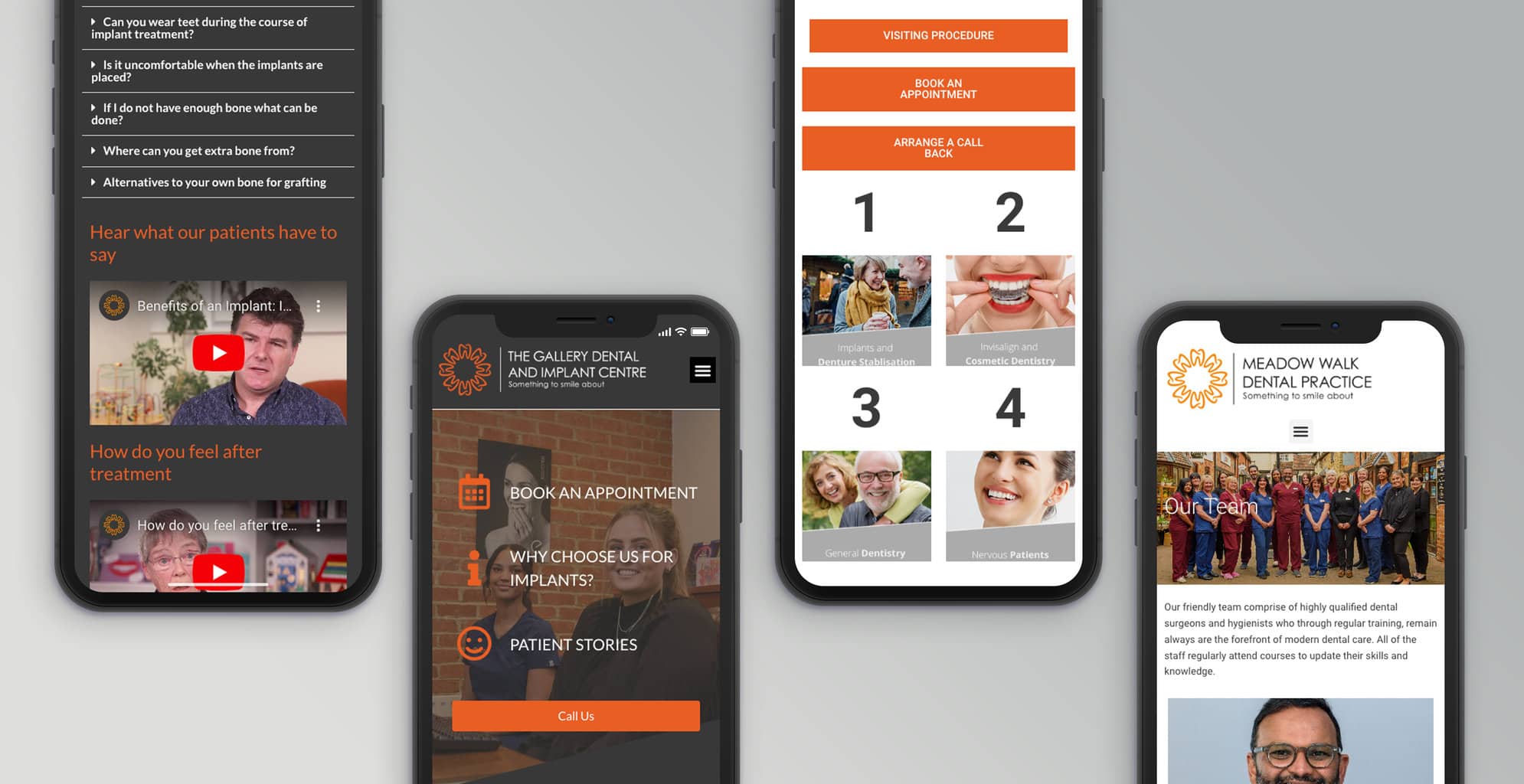
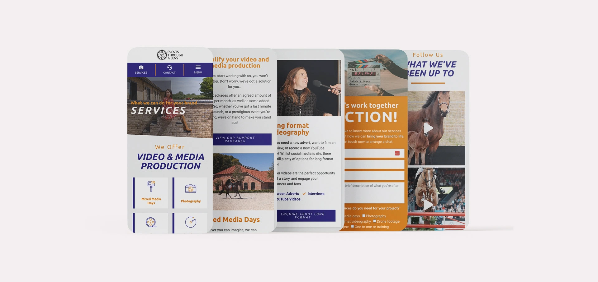
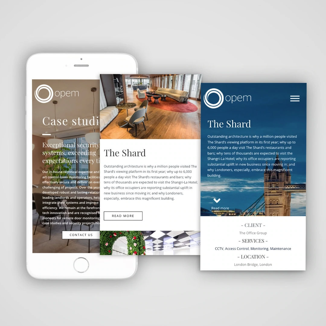
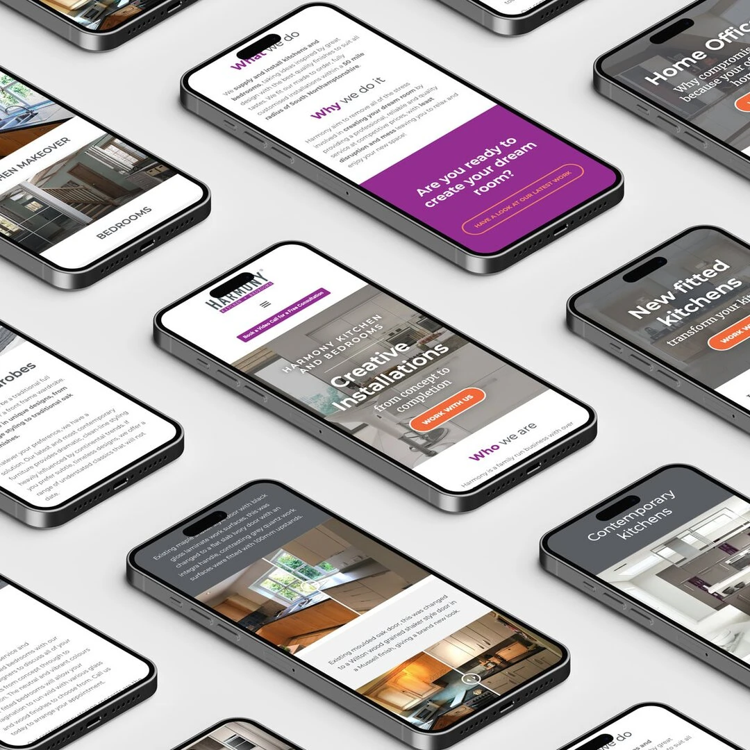
In the bustling digital landscape, the key to successful customer engagement lies in a website’s adaptability to various devices. This adaptability is precisely what responsive web design is all about. Responsive web design is the art of crafting websites that fluidly adjust and optimise their layout, content, and features to suit the screen size and capabilities of the device being used, whether it’s a desktop, laptop, tablet, or smartphone.
Consumers are constantly switching between devices, having a website that seamlessly caters to these different screens is no longer just an option but a necessity. A responsive website is the cornerstone of effective customer interaction, ensuring that users can access information, make purchases, and navigate effortlessly regardless of the device they use.
By prioritising a responsive design approach, businesses can enhance user experience significantly, allowing customers to enjoy a consistent and user-friendly interface across all platforms. Moreover, a well-implemented responsive design not only reflects a business’s commitment to convenience and accessibility but also builds credibility and trust among its customer base.
The Basics of User-Friendly Websites
Having a website that functions seamlessly across all devices is a fundamental aspect of establishing a strong online presence. A website that can effortlessly adapt to various screen sizes ensures that users can access information without any compromise in quality or usability. This adaptability is what responsive design aims to achieve.
In addition to cross-device functionality, easy navigation and clear, concise content play a pivotal role in delivering a positive user experience. Websites that boast intuitive navigation, allowing users to find what they need swiftly and without hassle, are more likely to keep visitors engaged and encourage them to explore further. When paired with easily digestible, well-organized content, this seamless navigation can significantly enhance the overall user experience.
The impact of responsive design on customer retention and conversion rates is noteworthy. With the majority of users accessing websites through their mobile devices, a website that lacks responsiveness can lead to frustration and an increased likelihood of users abandoning the site. On the contrary, a website that provides a smooth and consistent experience across devices fosters a sense of reliability and trust among users. This, in turn, can positively influence customer retention rates, encouraging users to return to the site for future visits. Moreover, a responsive design that ensures a seamless browsing and purchasing experience can contribute to higher conversion rates, ultimately translating into improved business performance and growth.
Choosing the Right Website for Your Business
In an increasingly competitive digital marketplace, having a responsive website can be a game-changer for businesses aiming for growth and enhanced customer engagement. A responsive website not only reflects a business’s commitment to providing a seamless user experience but also contributes significantly to improved search engine rankings, ultimately amplifying online visibility and driving organic traffic.
Moreover, in an era where mobile usage is skyrocketing, ensuring mobile compatibility is essential for businesses looking to connect with a broader audience. With a responsive website, businesses can effectively tap into the ever-expanding pool of mobile users, providing them with an optimal browsing experience regardless of the device they use. This inclusivity allows businesses to reach and engage with a wider demographic, thereby fostering brand recognition and customer loyalty.
Furthermore, the advantages of a website that seamlessly adjusts to different screen sizes cannot be overstated. A website that maintains its functionality and visual appeal across a diverse range of devices, from large desktop screens to compact mobile displays, ensures that users can access information and navigate with ease, irrespective of their chosen platform. By prioritising a responsive design that accommodates different screen sizes without compromising user experience, businesses can establish a strong and consistent brand identity, leaving a lasting impression on their target audience.
Understanding How a Responsive Website Helps Your Customers
A responsive website plays a pivotal role in enhancing customer satisfaction and fostering trust in your brand. By providing a seamless and user-friendly experience across devices, a responsive website demonstrates a business’s dedication to meeting its customers’ needs effectively. This commitment to convenience and accessibility can significantly contribute to improved customer satisfaction, encouraging positive interactions and fostering long-term relationships with your customer base.
Furthermore, the convenience of accessing information easily across different devices is a key benefit of responsive design. Whether customers are browsing on a laptop, tablet, or smartphone, a responsive website ensures that they can effortlessly access the information they seek without any hindrance. This accessibility fosters a sense of reliability and ease, instilling confidence in customers and affirming that the business values their time and convenience.
Moreover, responsive design plays a crucial role in ensuring a consistent brand experience for customers. By presenting a uniform look and feel across all devices, a responsive website enables customers to engage with your brand seamlessly, regardless of the platform they choose. This consistency not only strengthens brand identity but also fosters a sense of familiarity and trust, encouraging customers to engage more deeply with your products or services. By delivering a cohesive and immersive brand experience, a responsive website can leave a lasting and positive impression on customers, distinguishing your business in a crowded digital landscape.

Ensuring a Seamless Experience for Your Customers
Quick loading times and user-friendly interfaces are integral to customer satisfaction in the digital realm. A responsive website that prioritises fast loading times ensures that customers can access information swiftly, without experiencing frustrating delays. By providing a seamless browsing experience, businesses can enhance customer satisfaction, demonstrating a respect for their time and attention. Additionally, an easy-to-navigate interface contributes to a positive user experience, enabling customers to find what they need efficiently and with minimal effort.
Moreover, a user-friendly website can significantly boost customer engagement and drive sales. By offering intuitive interfaces and hassle-free navigation, businesses can encourage customers to explore their products or services further, increasing the likelihood of conversions. A website that is easy to use not only facilitates a smooth browsing experience but also instills confidence in customers, encouraging them to make informed purchase decisions. This heightened engagement can lead to improved customer retention and loyalty, ultimately translating into a boost in sales and business growth.
Furthermore, in today’s multi-device landscape, the need for a website that is easy to navigate across all platforms cannot be overstated. Whether customers are accessing the website through a desktop, laptop, tablet, or smartphone, a responsive design that ensures consistent navigation and functionality is paramount. By prioritizing a website that is equally accessible and user-friendly across various devices, businesses can cater to the diverse preferences of their customer base, enhancing their overall satisfaction and fostering long-term relationships with their audience.
Making the Right Investment for Your Business
Investing in a responsive website is an investment in your business’s future success. Prioritising a website that ensures a seamless and user-friendly experience across all devices is crucial for staying ahead in the digital landscape. By embracing responsive design, businesses can not only enhance customer satisfaction and engagement but also pave the way for sustainable long-term growth. The ability to reach a wider audience and deliver a consistent brand experience positions businesses for continued success and prominence in the ever-evolving online marketplace.
A responsive website is a cornerstone of modern business success, fostering improved customer engagement, satisfaction, and ultimately, growth. As you consider purchasing a website, it’s crucial to make an informed decision that prioritizes user experience across all devices. By choosing a responsive design, businesses can ensure a seamless and accessible online presence, catering to the evolving needs of their customers. Investing in a website that adapts effortlessly to various screens not only reflects a commitment to customer satisfaction but also establishes a strong foundation for sustained success.